 Creating a book cover is a partnership between book designer, author and publisher. Each contributes a different essential element to the process of making your book stand out among thousands of others. Here is where artistry and marketing meet.
“The one-second glance of a browsing customer determines whether they pick it up (or click online), or pass by. In that fleeting moment, your cover must attract their attention, show them what the book is about, and motivate them to investigate further.” [Writing Your Nonfiction Book]
The author must make clear what the book is about – its mood, its theme – and the readers they want to attract, while the artist assembles imagery to give this visual impact.
 An ebook cover allows only one surface for visual impact and is displayed as a tiny tile online, but must still be readable.
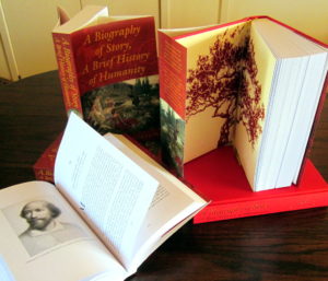
Print provides multiple artwork opportunities: for front, back and spine (often overlooked but what customers see first on a shelf), for ‘winged’ covers, for the dust jacket and board colour of a hardback edition and the fine touch of decorated endpapers.
Ideally, cover images evoke emotions. For fiction, guns, knives, blood and corpses signal crime and horror; bursting bodices and bare flesh flash erotica; and dragons breathe fire over fairy castles in fantasy.
Non-fiction can be more challenging to portray, especially for a book like A Biography of Story, A Brief History of Humanity with a time-span from prehistory to the digital age and a global scope. And although the theme is the power of stories and storytelling, this is not a children’s book, but an interweaving of social history and literature – we had to make that visually clear.
We started with a ‘mood board’ – a collection of ideas, images and colours that all contributed in some way to the theme and content of the book. The symbolic power of colour is especially important since much of its influence is subconscious.

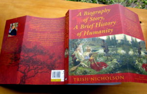
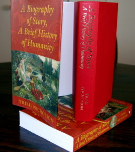 This shade of red (commonly used to depict the earth’s core), was chosen for the cover background and hardback boards because it is the hue of the Australian central desert, home to the oldest continuous culture in the world. A Biography of Story opens with an Australian Aboriginal tale. It is also close to the ‘venetian red’ beloved of Renaissance artists who sometimes took extreme measures to acquire the right tint.
Red is also the earliest pigment found by archaeologists in ancient burial sites, along with ochre – a sandy-gold yellow – so we chose pale ochre as the background colour for the hardback endpapers and for the text on the cover.
We emphasised the time span by placing a shadow image of prehistoric cave paintings behind the red.

Not only history but also ‘storytelling’ and ‘literature’ had to be depicted on the cover, but as an adult theme. Salvatore Postiglione’s 19th century painting of a scene from Boccaccio’s Decameron was doubly appropriate, because Boccaccio with his wonderfully earthy stories is one of the featured storytellers. He shares a chapter with Chaucer, revealing intriguing parallels in their lives.


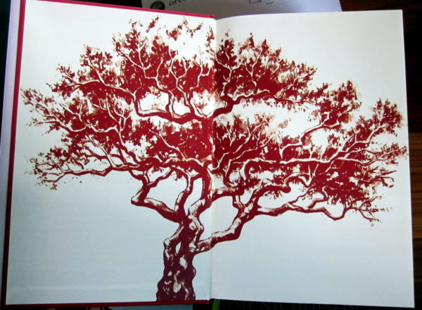
And finally: the acacia tree. This monochrome watercolour was commissioned for the book, along with several interior illustrations, from talented artist and illustrator Graeme Neil Reid who has produced artwork for major publishers. The tree is a truly ancient symbol and retains its emotive power for us still. Symbolic of life, growth, diversity and longevity from deep roots to newly emerging leaves, the tree perfectly encapsulates the power and significance of stories.
“Stories are like deep-rooted trees that survive through flood, drought, heat and cold to provide fruits that nourish each generation gathered within the shade of their branches.” [A Biography of Story, A Brief History of Humanity]
We placed the tree image on the back cover; as a frontispiece to both editions; and to decorate the endpapers of the hardback. This distribution helped to integrate the various visual elements, further assisted by extending the front and back cover images and background colour onto the flaps of the hardback jacket, and the ‘wings’ of the paperback. In this way too, the same artwork produced both the paperback cover and the hardback dust jacket.

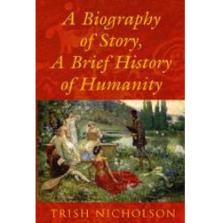 With so much visual symbolism, the final arrangement of colour, imagery and text on the front cover had to impose a simple, clear, recognisable structure. The intention was a slightly retro feel, a sense of familiarity for general readers interested in history, literature and the humanities.

And what about the spine – perhaps the only part a browser will see in a bookshop? Colour and texture are continued across the spine with the addition of a medallion image from the painting on the front as a teaser.
What you can achieve on the spine is limited by its width, which depends on the number of pages, paper thickness and binding method. We had a good workable spine space (3 cm) because the book is 480 pages in extent and – for reasons explained in a post here – is printed on 100 gsm paper which is thicker quality than standard.
More tips for non-fiction cover design:
- Unless you are a graphic artist, I strongly recommend you hire a professional cover-design service.
- Look at book covers in bookshops, online and on cover-design websites to find ideas and see how different covers for fiction and non-fiction can be.
- Test out particular photographs and images you want to use on colleagues and friends: an image that means one thing to you, may evoke something different in a reader; and for print, it must be a high resolution image.
- Brief your designer carefully, including a title and subtitle clearly indicating the book’s contents succinctly – think ‘newspaper headlines’. It can be clever, include a pun for example, but obscure allusions do not attract non-fiction readers. They want to learn or gain something.
- Bright primary colours (or blocks of black, or white) have visual impact, and fonts must be large enough and clear enough to be read at thumb-nail size online.
- There is more scope and space on a print book for descriptions and images: an ebook front cover can work in print, but a cover designed for a print book which is read at close quarters, may not work for an ebook.
- Use the back cover of the print book for a good blurb, review quotes, or endorsements, but leave clear at least 4 cms from the bottom edge for the bar code and ISBN (these enable the book ID and price to be scanned and are essential for a book to be sold through the retail trade).
I hope these tips and this anatomy of my book cover have sparked some inspiration for your own, and if it did ‘attract your attention and motivate you to investigate further’, you can read more about A Biography of Story, A Brief History of Humanity in a post which has links to the book’s List of Contents and Introduction.
I have shared here some of the issues I faced in sourcing and printing the fifty black and white illustrations for ‘Story’.
